What is a WMP skin?
WMP or Windows Media Player Skin is a way of customizing how the media player looks. Basically a wmp skin is a .wmz file found on "X:\Program Files\Windows Media Player\Skins\" folder (Replace X with your drive letter). Here we shall atempt to create a simple skin, from which you can create more advanced skins.
WMZ File Format
WMP Skins consists of a collection of files zipped together. So it means, the WMZ file on your computer is actually a .ZIP file. Inorder to decompress the file and view the content files, rename the .WMZ file to .ZIP and use a unzipping utility such as WinZIP or WinRAR to extract the containing files.
Take for example the Classic.wmz file, renaming and extracting gives us the following files:
classic.wms                 classic.js    back_disabled.bmp           back_down.bmp
back_hover.bmp              back_up.bmp    currentpos_background.bmp   currentpos_thumb.bmp
divider.bmp                 ffw_disabled.bmp   ffw_down.bmp                ffw_hover.bmp
ffw_up.bmp                  forward_disabled.bmp  forward_down.bmp            forward_hover.bmp
forward_up.bmp              icon_stereo.bmp   icon_wmlogo.bmp             intro_disabled.bmp
mute_down.bmp               mute_hover.bmp   mute_up.bmp                 next_disabled.bmp
next_down.bmp               next_hover.bmp   next_up.bmp                 pause_disabled.bmp
pause_down.bmp              pause_hover.bmp   pause_up.bmp                play_disabled.bmp
play_down.bmp               play_hover.bmp   play_up.bmp                 prev_disabled.bmp
prev_down.bmp               prev_hover.bmp   prev_up.bmp                 rw_disabled.bmp
rw_down.bmp                 rw_hover.bmp   rw_up.bmp                   stop_disabled.bmp
stop_down.bmp               stop_hover.bmp   stop_up.bmp                 toggle_down.bmp
toggle_hover.bmp            toggle_up.bmp   volume_background.bmp       volume_thumb.bmp
The main file in this collection is the "Classic.wms" file. It is just an XML file and can be edited or created with any text editing software.
Can't see the WMZ extension?
Goto folder options and uncheck "Hide Extensions of known Type"
Click here to Download the sample skin file made in the following section.
Starting with your own skin ...
- Make a folder in the ":\Program Files\Windows Media Player\Skins\", with a suitable name, as in my case "digitalpbk".
- Next inside the folder make a new file, with the name and extension ".wms" , (digitalpbk.wms).
- Paste the following code with suitable substitutions
Show/Hide Code
author="Arun P"
copyright="(c)2006 http://digitalpbk.blogspot.com . All rights reserved."
version="1.0"
> - Save the file.

Now we have made a base for our skin. Check out if you have done it right, by taking the WMP Skin chooser. Look for the skin with the name you have given (digitalpbk), and click it. Depending on the version of WMP you are using you will see a white rectangle. The Picture here shows the skin on Windows Media Player 11. - Next we can start making the actual theme. Modify the view node to accomodate the following :
Show/Hide Codeleft="0" top="0" width="600" height="267"
resizable="false"
minWidth="600" minHeight="267"
titlebar="false"
title="Digitalpbk"
scriptFile="digitalpbk.js"
onload="init()"
backgroundColor="none"
>
Make a new js file under the folder (Skins\digitalpbk\). For eg: digitalpbk.js. This will be our primary script file. As you can see it is very much similar to a HTML,
id represents the name or identifier of the tag (node)
left, top, width, and height give the dimensions
minWidth and minHeight restricts the minimum possible size of the Skin (not used on resizable="false") just given for illustrative purpose.
resizable="false" specifies that our skin cannot be resized,giving false makes it remains in the specified dimensions.
titleBar="false" hides the title bar (The one on top with the Close, Maximize, And Minimize buttons).
scriptFile represents our javascript file which handles the programming part of the skin.
onload and onresize are events which are triggered when the window is loaded or resized respectively. Please note that the onresize event is not called in case the skin is not resizable.
backgroundColor="none" specifies that the skin is transparent in areas where nothing is there. Alternatively you can specify a color to fill those areas, but transparency is cooler.
At this point if you apply the skin you wont be able to see anything! In case you applied the skin and want to return to the full mode, press Ctrl + 1 to return to full mode. - Regions in the Main View are divided into various Sub Views. Now we are into the actual making of the user interface, the buttons, the sliders etc.
First we place a base for the control view, with a suitable background. The following code comes under the View node. ()
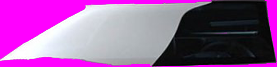
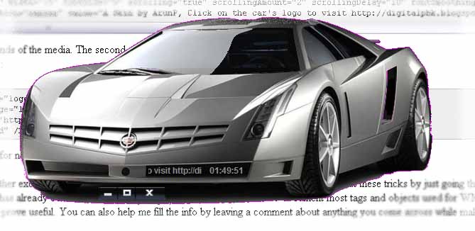
You can generally use any background image of formats bmp,png,gif etc. I have used a png file with a car as base. When making the picture portions you want to be left transparent must be filled with a particular colour (#FF00FF commonly used). This colour is specified in the transparencyColor attribure.
Now the product looks somewhat like this: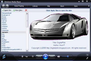
- Next we place buttons for minimizing, closing and return to full mode. Let us place them somewhere in the bottom center. (Inside the subview node)
Show/Hide Codeimage="mfx_norm.gif" hoverImage="mfx_over.gif"
downImage="mfx_over.gif" mappingImage="mfx_map.gif"
transparencyColor="#ff00ff" >
This code places three buttons with hover effects.
image attribute specifies the normal image file
hoverImage specified the hover image file
mappingImage provides the map of the buttons so that the program knows to differentiate the three buttons.Normal Image : 
Hover Image : 
Mapping Image : 
The mapping color specified in the buttonelement tag is the colour given on the mapping image. Thus three buttons with hover effects are ready.
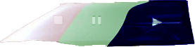
The onclickevents does the functions specified and can be easily understood. cursor="hand" specifies the cursor type when over the buttons. - Similarly we will place buttons Play, Pause, Stop, Next Previous etc.
Show/Hide CodehoverImage="pps_over.png" downImage="pps_over.png" mappingImage="pps_map.png"
transparencyColor="#ff00ff" >upToolTip="Stop" cursor="hand"/> upToolTip="Pause" cursor="hand"/> upToolTip="Play" cursor="hand"/> Normal Image : 
Hover Image : 
Mapping Image : 
- Next we add a volume slider bar.
Show/Hide Code
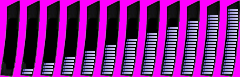
NormalImage is a series of images for each position of the volume.min="0" max="100" borderSize="0" image="vol.png"
positionImage="vol_pos.png" enabled="true"
value="wmpprop:player.settings.volume"
value_onchange="wmpprop:player.settings.volume = value;updateVolToolTip('volume');player.settings.mute = false;"
cursor="hand"
toolTip="Volume" onMouseUp="toolTip='Volume'" transparencyColor="#ff00ff" />
positionImage is map of grayscale gradient representing a series of buttons indicating volume levels.
Value indicates the volume value and initialized to the volume. When changed, the volume is updated. updateVolToolTip is a javascript function which updates the volume tooltip and its code is pasted in the "digitalpbk.js" which is as follows:
function updateVolToolTip(id){
vol = "";
vol += player.settings.volume;
eval(id + ".toolTip = vol" );
}
Normal Image : 
Position Image : 
- Next let us learn how to add dynamic and scrolling text.


Show/Hide Code
fontStyle="bold" justification="center" value="wmpprop:player.controls.currentPositionString" fontFace="arial narrow,arial,tahoma,verdana" />
fontStyle="bold" justification="center" value="A Skin by ArunP, Click on the car's logo to visit http://digitalpbk.blogspot.com to find out how you too can make cool skins like this, easily." fontFace="arial narrow,arial,tahoma,verdana" />
The first one displays the position in seconds of the media.
The second one displays a scrolling text.
Similarly you can add dynamic text that displays the Media Name, Bitrate, Volume, and other effects, and add your own custom text.
Show/Hide Code
hoverImage="logo_over.png" downImage="logo.png"
onClick="jscript:player.launchURL('http://digitalpbk.blogspot.com/')"
upToolTip="Visit blog" cursor="hand" />
Click here to Download the skin file we just made (if you already haven't done so).
Winding up
Hope this section was interesting and helpful, any comments, suggestions or info? Please feel free to comment...
No comments:
Post a Comment